|
2.4.9. Primary Energy Consumption Histograms

|
|
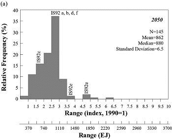
Figure 2-9a: Histogram showing frequency distribution
of global primary energy consumption in 2050 for 145 scenarios. The upper
horizontal axis shows indexed primary energy consumption (1990 = 1); the
lower axis indicates approximate absolute values by multiplying the index
by the 1990 value (370 EJ). For reference, primary energy consumptions of
the IS92 scenarios are indicated. The frequency distribution associated
with scenarios from the literature does not imply probability of occurrence.
|

|
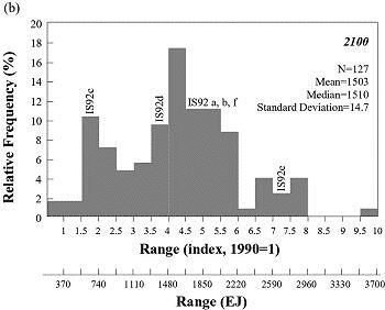
| Figure 2-9b: Histogram showing frequency distribution
of global primary energy consumption in 2100 for 127 scenarios. The upper
horizontal axis shows indexed primary energy consumption (1990 = 1); the
lower axis indicates approximate absolute values by multiplying the index
by the 1990 value (370 EJ). For reference, primary energy consumptions of
the IS92 scenarios are indicated. The frequency distribution associated
with scenarios from the literature does not imply probability of occurrence. |
The final two histograms, Figures 2-9a and 2-9b,
give the global primary energy consumption ranges for 2050 and 2100, indexed
to 1990. The total range in 2100 is between 330 EJ and 3400 EJ, which corresponds
to difference of more than a factor of ten. This factor range is about the same
as the factor range for gross world product (10.7) and much larger than that
for population.
The distribution of primary energy consumption in 2050 is asymmetric, with
a long but thin tail toward high levels. Most of the distribution is between
600 and 1300 EJ, or about 1.5-3.5 times the 1990 level of consumption. The higher
value corresponds to the continuation of a historical growth rate of global
primary energy consumption of about 2.2% per year. Most of the scenarios cluster
around 1000 EJ, which is about three times that of 1990. A total of 145 different
scenarios were used to derive this histogram.
In 2100, the distribution of primary energy consumption is much less concentrated
and covers the full range, from about 10 times the 1990 level (to 3400 EJ) to
a slight decrease by a factor of 0.9 (340 EJ). However, only a few scenarios
occur toward these extreme values of the two distribution tails. The rest of
the observations portray an interesting structure that resembles a trimodal
distribution. The first mode is around 2600 EJ, the second around 1700 EJ, and
the third at about 700 EJ. The median of the whole distribution is at 1500 EJ.
Interestingly, the continuation of the historical growth rate of about 2.2%
per year corresponds to about 11 times the 1990 level (about 4050 EJ in 2100),
well above any values observed in the database. Thus, in contrast to data for
2050, all the scenarios for 2100 foresee a level of primary energy consumption
that is lower than that of trend extrapolation. Altogether, 127 different scenarios
were used to derive the histogram for the year 2100.
2.4.10. Relationships between Primary Energy and Gross World Product
In all scenarios, economic growth outpaces the increase in energy consumption,
which leads to substantial reductions in the ratio of primary energy consumption
to gross world product, also known as "energy intensity." Individual technologies
progress, inefficient technologies are retired in favor of more efficient ones,
the structure of the energy-supply system and patterns of energy services change;
these factors reduce the amount of primary energy needed per unit of gross world
product. With all other factors being equal, the faster the economic growth,
the higher the turnover of capital, and the greater the decline in energy intensity.
These long-term relationships between energy and economic development are reflected
in the majority of scenarios and are consistent with historical experience across
a range of alternative development paths observed in different countries.
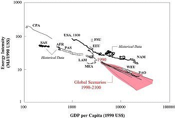
Figure 2-10 shows the historical relationship since 1970
between energy intensity and GDP per capita for various world regions (see IIASA-WEC,
1995). This shorter record of development is contrasted with the experience
of the USA since 1800. Although there are consistent differences among regions
and energy paths, the level of energy intensities in developing countries today
is generally comparable with the range of the now-industrialized countries when
they had the same level of per capita GDP (see Figure 2-10).
The historical experiences illustrate that different countries and regions can
follow different development paths; moreover, there are some persistent differences
in energy intensities even at similar levels of per capita GDP.
Global energy intensities diverge across different scenarios, as shown in the
shaded wedge in Figure 2-10. The wedge clearly illustrates
a persistent inverse relationship between economic development and energy intensity
across the wide range of scenarios in the database, despite numerous differences
among them.

Figure 2-10: Primary energy
intensity versus GDP per capita - regional historical developments (1971
to 1990), USA (1800 to 1990), and in global scenarios; energy intensity
in MJ per US dollar at 1990 prices and per capita in US dollars. Abbreviations:
AFR, Sub-Saharan Africa; CPA, Centrally Planned Asia and China; EEU,
Eastern Europe; FSU, Former Soviet Union; LAM, Latin America and the
Caribbean; MEA, Middle East and North Africa; NAM, North America; PAO,
Pacific OECD; PAS, Other Pacific Asia; SAS, South Asia; WEU, Western
Europe. Data sources: IEA, 1993; World Bank, 1993; Morita and Lee, 1998;
Nakicenovic et al., 1998b.
|
|